I’ve been helping the R&D team at the New York Times on several projects since 2019. They’re a crew of hybrid designer/developers and strategists, exploring how emerging technologies can be applied in service of journalism.
One project in 2021-22 involved helping them think about design patterns for spatial computing. How might the NYT adapt if spatial interfaces go mainstream in the near future? I spent a few months sketching and prototyping in Unity, on AR-equipped phones and headsets like the Hololens and Oculus Meta Quest, building up maps, taxonomies and patterns for how this stuff might work in the context of journalism.
Framing and mapping
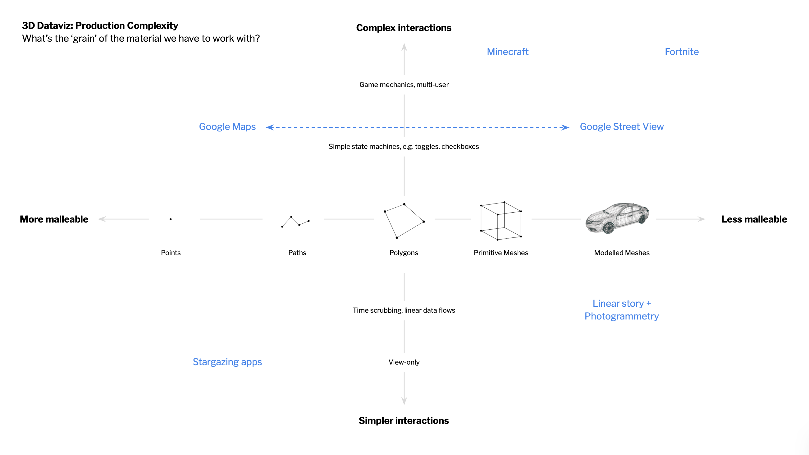
I typically start exploratory projects with a little bit of mapping and orientation to help us set a rough direction. This is usually pretty fast and loose – the goal is to sketch out a broad range of territory to explore with prototypes.
Sketch prototyping
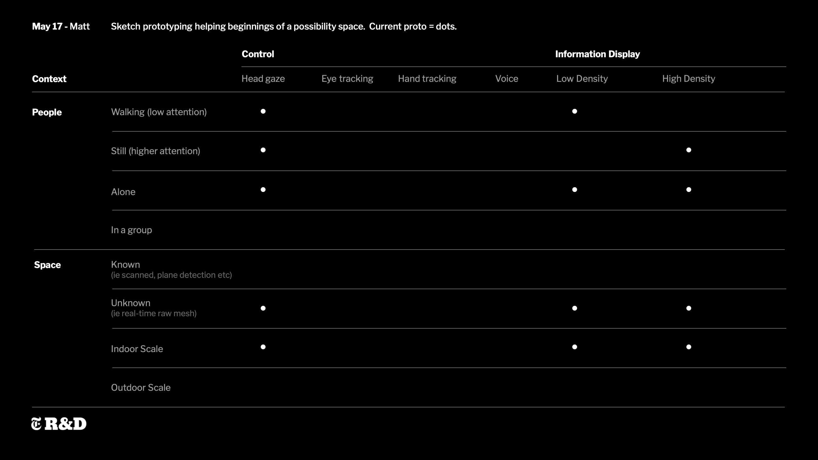
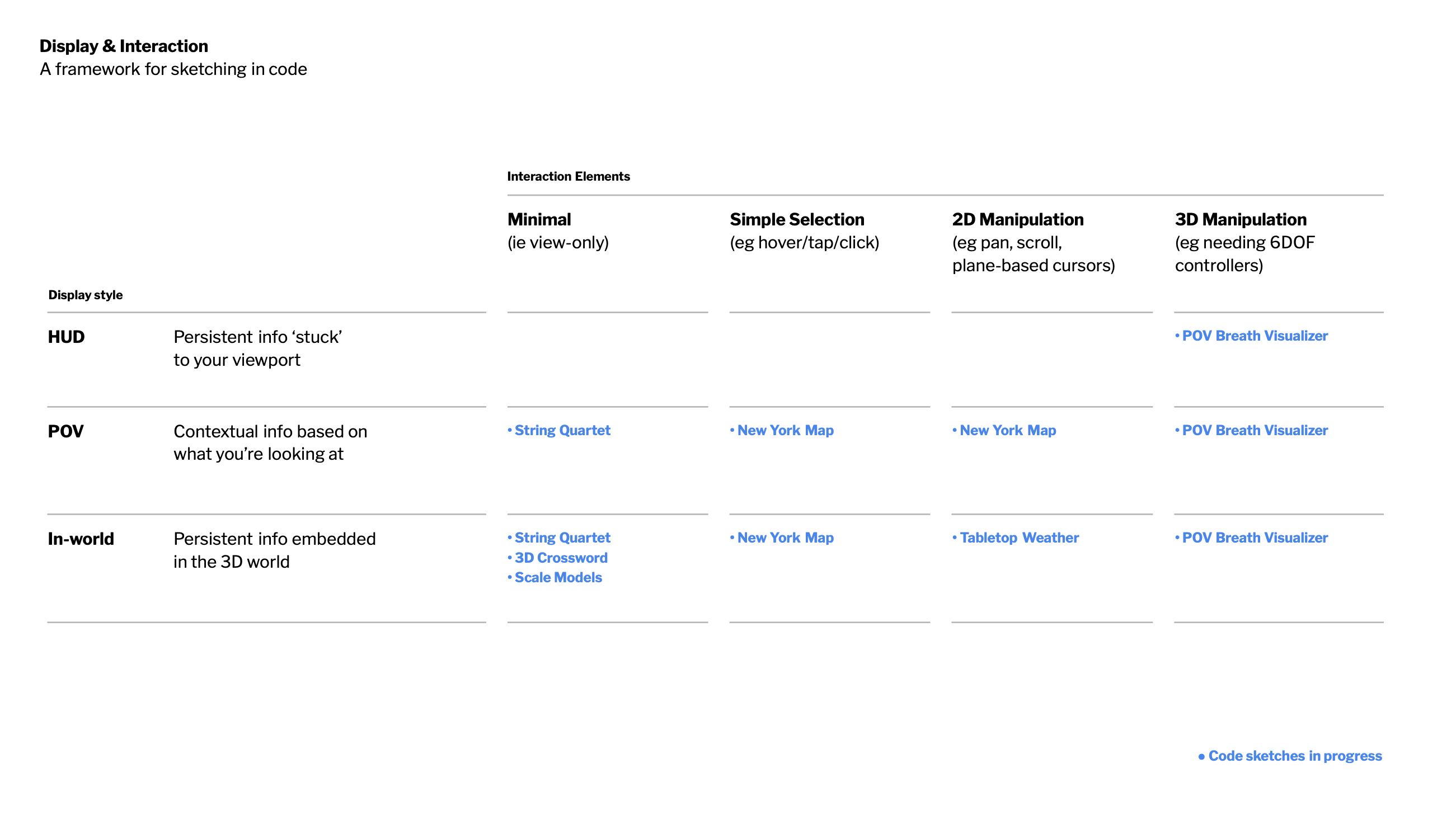
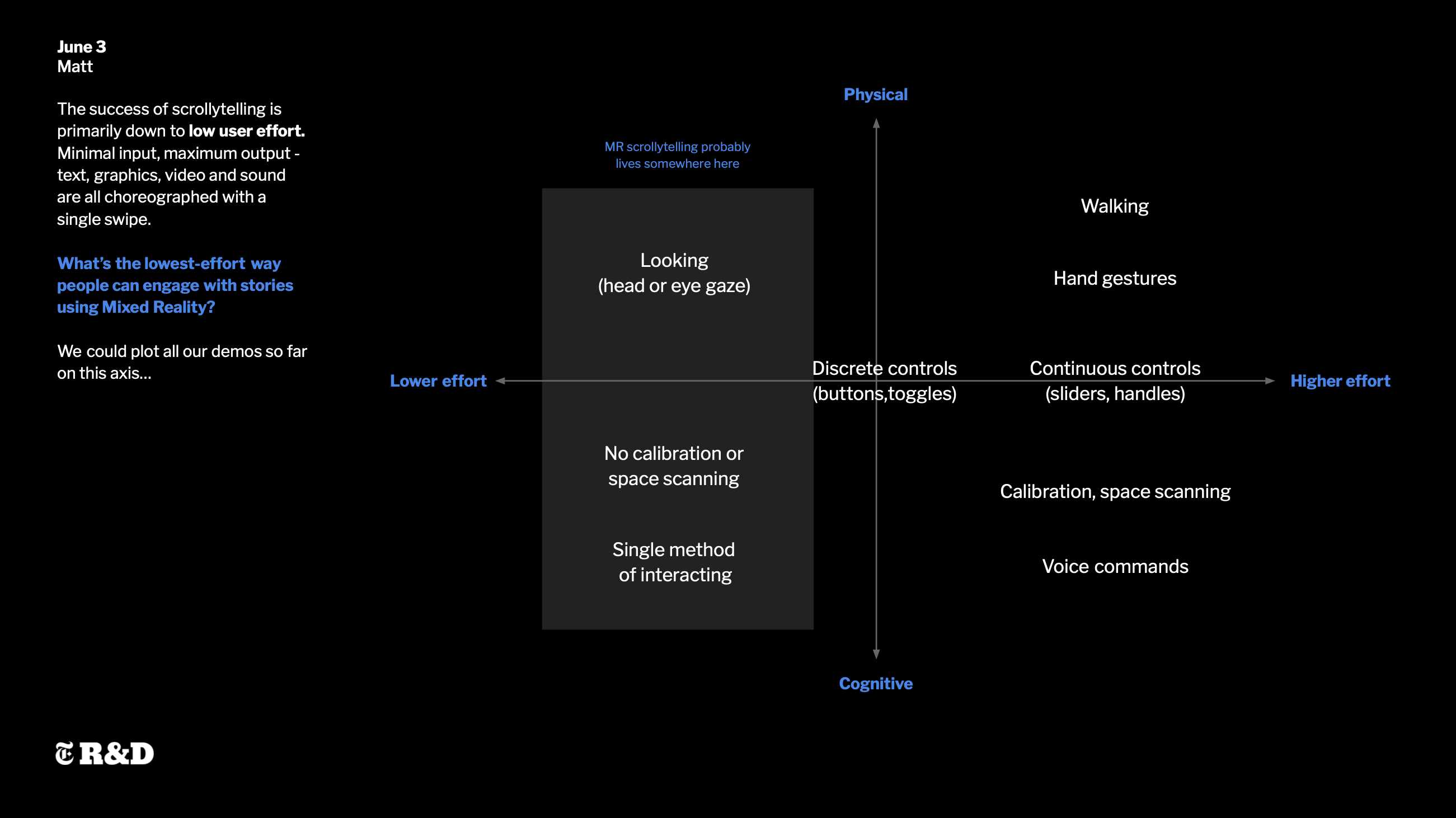
After doing a little mapping, the next job is to populate the maps with lots of little prototypes, helping us learn more about how this stuff actually feels – what are the affordances of the tech? What does it do well? What does it suck at? What are the applications, and what are the implications?
Kitchen table use cases
Probably the main way all we get our daily news is during the morning breakfast routine, whether it be in print, an app, or a podcast. If we were to sit at the kitchen table and use a spatial interface, what types of information and interaction design would be possible? Which bits would be better or worse than on a 2D screen, or in print, and what might this mean for journalism?
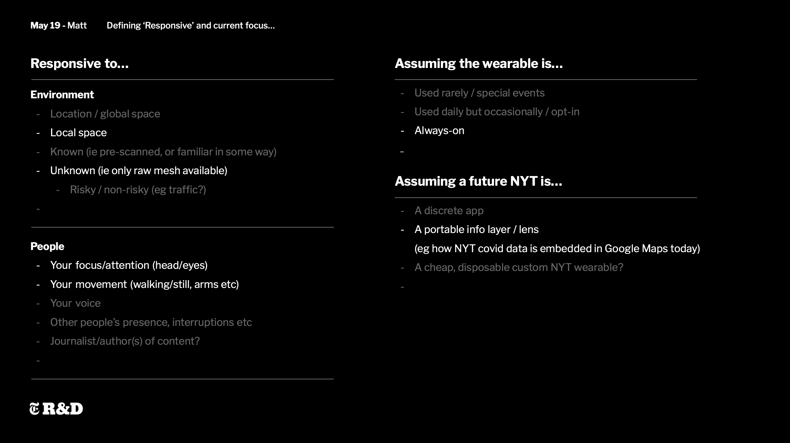
Spatially responsive layout
Should interfaces be able to float around, or lock to the surfaces around us? Do certain surfaces (walls, tables, worktops) lend themselves to certain types of information? When does 3D work best, and when is 2D superior? The best way to find out is to build a lot of tiny demos and try them all out.
From fully immersive to glanceable
Some types of stories work brilliantly well at fully-immersive, 1:1 scale in VR, but what happens if a spatial layout requires more space than you have in your living room? We’ve all seen those videos of people in VR headsets running into walls.
Perhaps we need responsive, adaptive layouts, that can scale between fully immersive environments, tabletop- or plinth-scale models, and HUD-based floating panels and controls. Stories might need an adaptive sense of scale too.
Adapting to mobility
Another important use case is ‘not being hit by a bus while using this’. How might spatial interfaces adapt to us walking around, dealing with distractions and alerts, and what might this mean for journalism?
Finding the design patterns
At the end of each prototyping phase, we’d have enough sketch prototypes to begin finding generalizable patterns and rules. I’d then put together little interactive diagrams to help capture and distill what we learned.
This project was one of many similar explorations going on at the time – you can read more over on the New York Times R&D site.