I worked on the design and art direction of the launch version of Schooloscope, a Channel 4-funded project by BERG that took UK schools data and explored how to make it more useful for more people.
With direction and input from the rest of the BERG crew, I helped invent the product itself, then looked after the information architecture, designed the user interface, art directed, designed and produced all the graphics for the launch version, working alongside Tom Armitage, who looked after engineering and development.
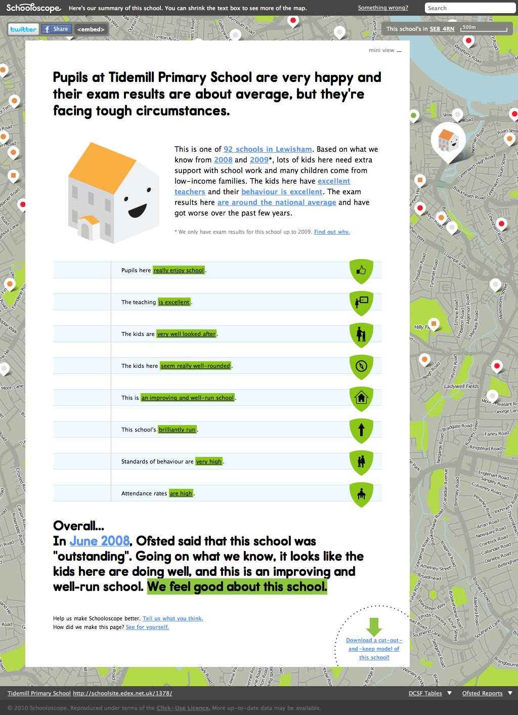
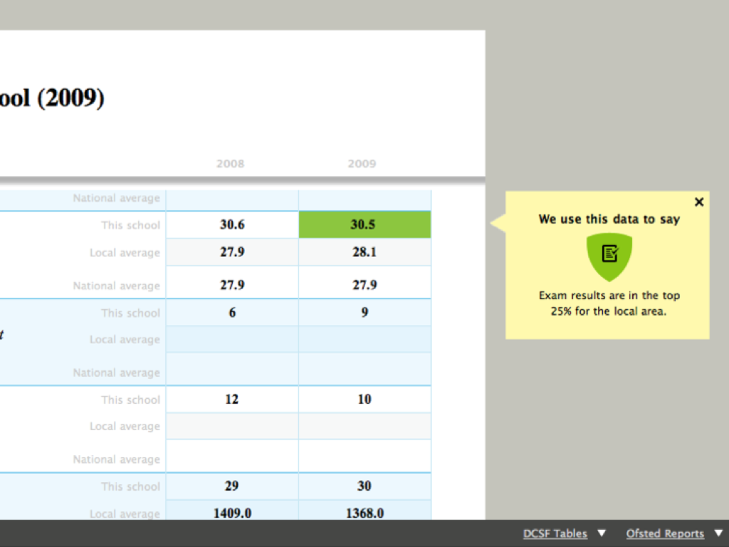
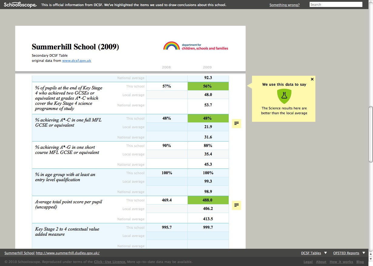
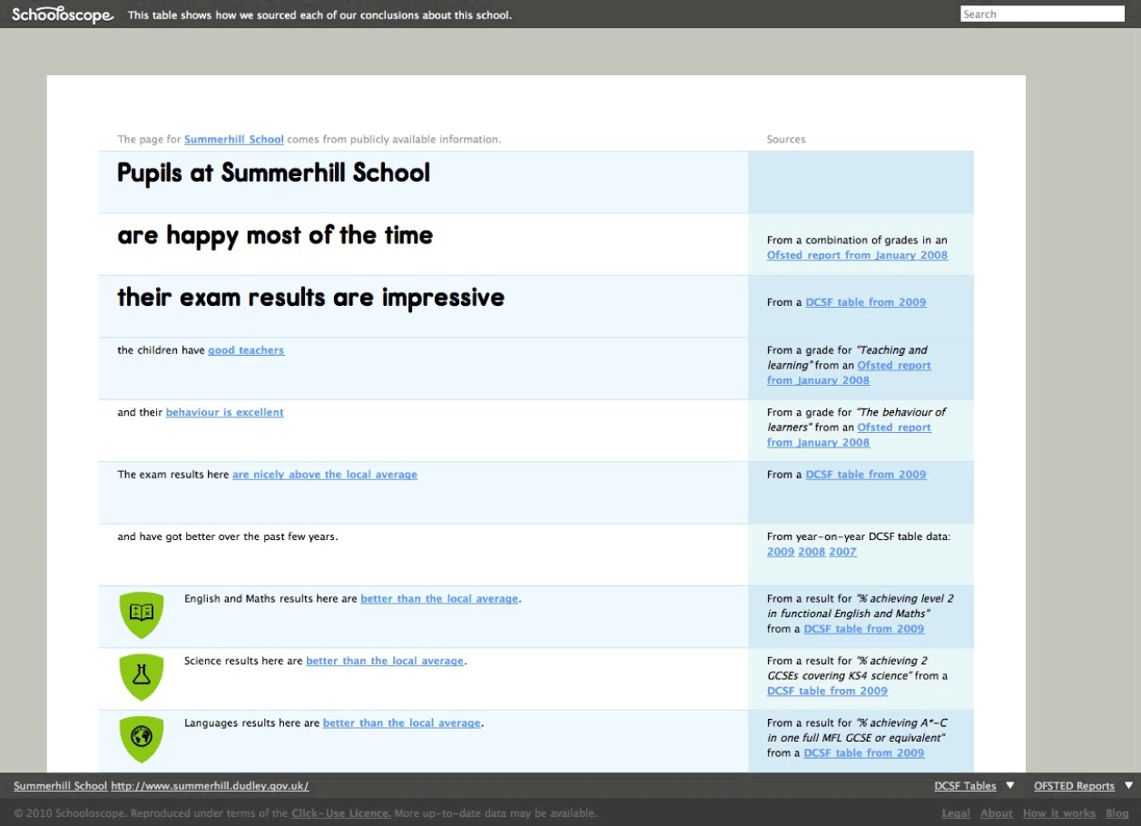
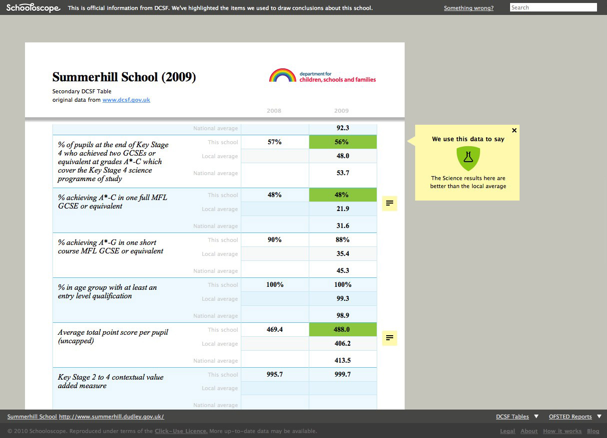
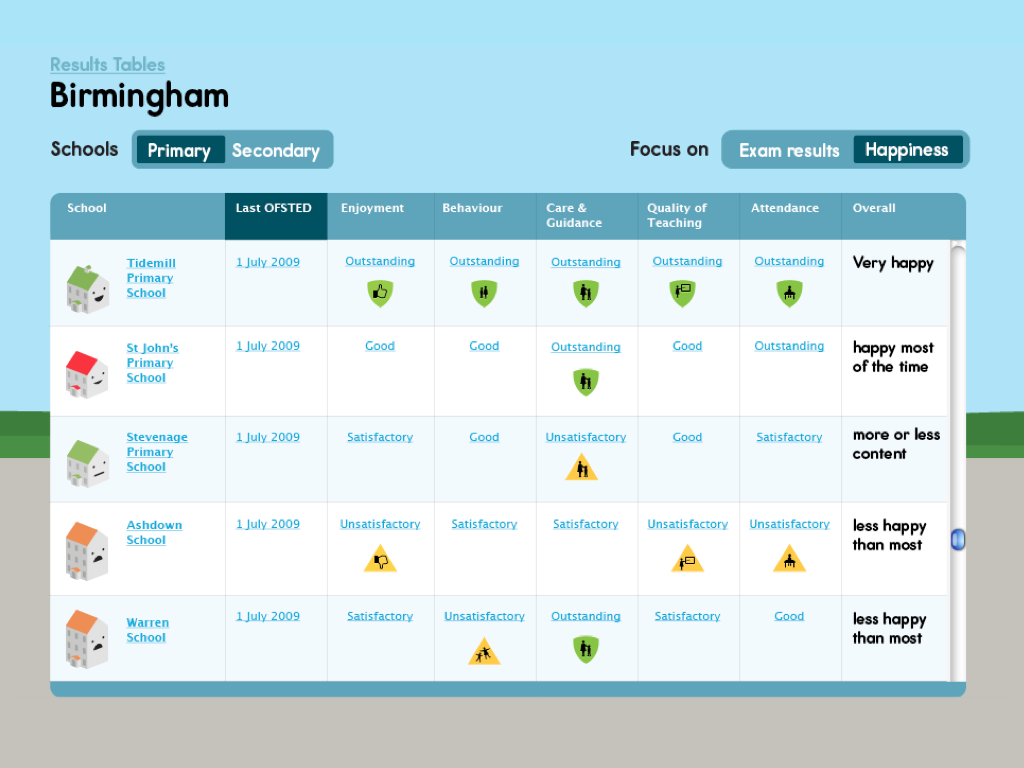
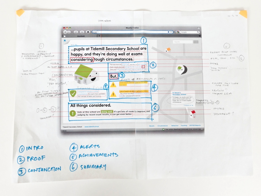
Schooloscope worked by finding and presenting a range of data – such as Ofsted reports and Performance Tables – and generating simple, conversational summaries from them. It was kind of like a journalism robot, designed to help people who don’t like reading charts and graphs.
Nearly all the text on each school’s page was dynamically generated from government data, and linked back to it. Tom and I (with help from the rest of the BERG team, and the lovely Giles Turnbull) created a generative summary tool, that slurped up all the dry data from government tables and turned it into simple, direct, conversational phrases that link together in a (mostly) natural, human way.
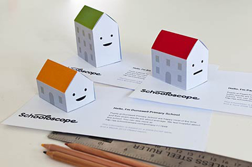
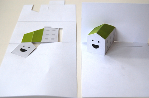
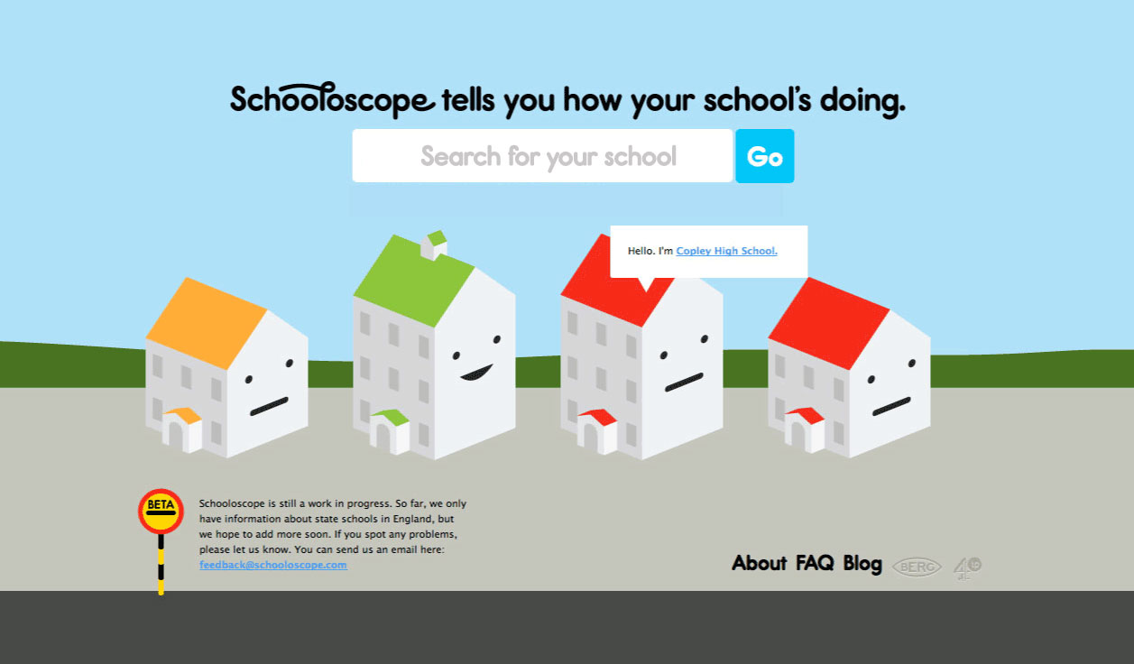
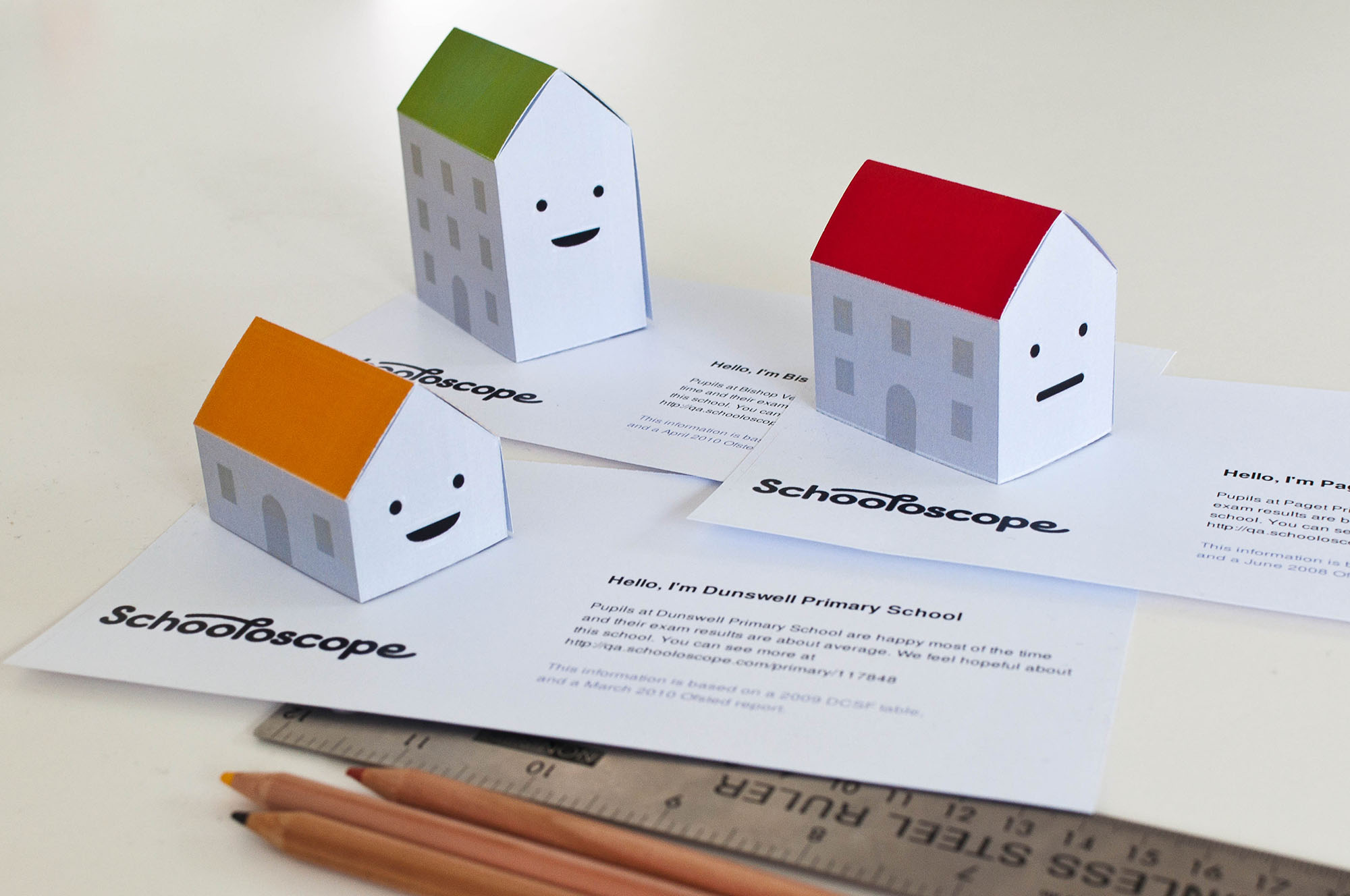
Every school on the site was represented by an image of a little school building with a face on it. The image visualizes some of the dataset: the size of the school; academic performance (roof colour); and kids’ happiness (sad or happy face).
This let us help communicate complex information in a more visceral, evocative way, such as an academically excellent school full of unhappy kids, or a school full of happy, well-behaved and cared-for children that perhaps weren’t academically strong.
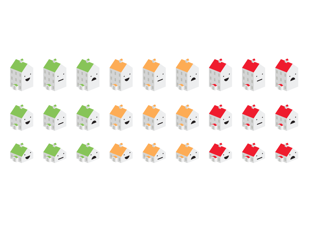
The technique was borrowed and adapted from statistician Herman Chernoff, who pioneered visualising datasets using human features in the 1970s.
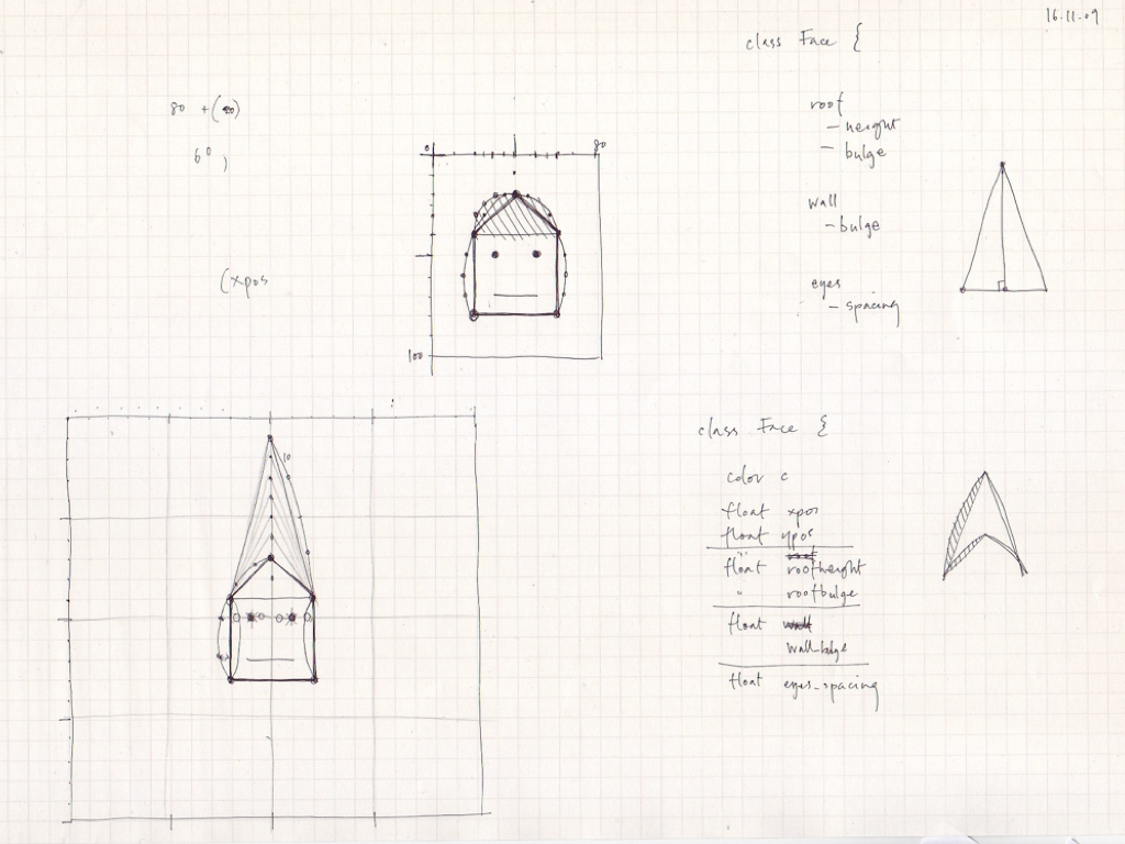
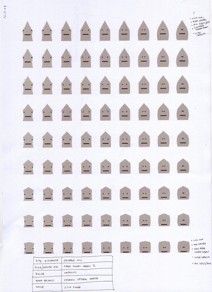
During the design process I did a lot of thinking through drawing – here, what an array of schools with different data might look like. I explored using more facial features, such as eye distance, roof pitch and bulging walls (say, to communicate capacity).
More sketching, this time with live (well, pretend-live) data. BERG were great at sketching in many media; I used Processing and PureData as tools to quickly explore simple, throwaway ideas around data-driven graphics and text.
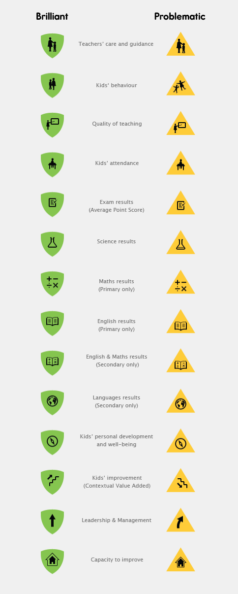
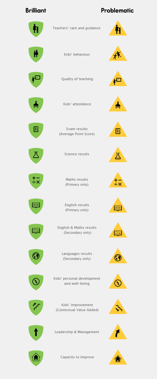
Using qualitative government data from Ofsted, such as pupils’ enjoyment, attendance, behaviour and quality of teaching, meant that we could design new types of league tables – based on kids’ happiness, not just academic achievement.
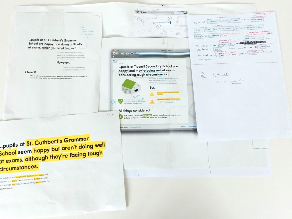
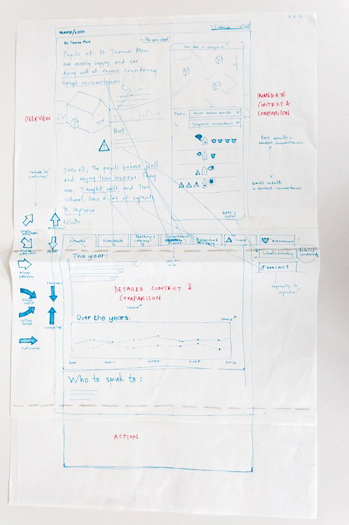
Here’s some initial sketching on paper, where we’re working out how to make the page feel like two parents chatting at the school gate…
…and this is how the first version ended up.
I got to work on nearly every aspect of the launch site: material exploration; product invention; information architecture; user interface; icons; typography and so on.
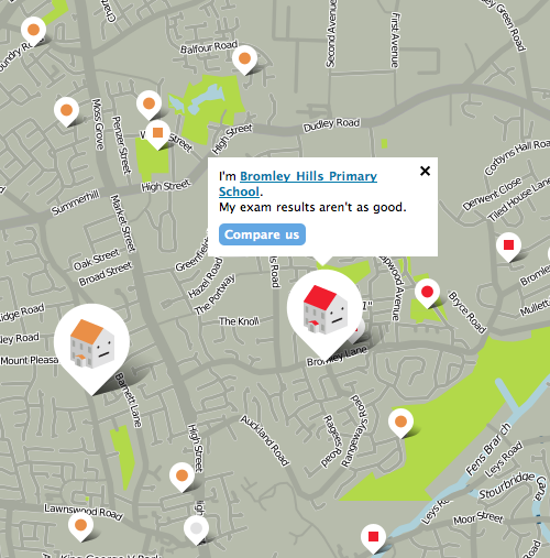
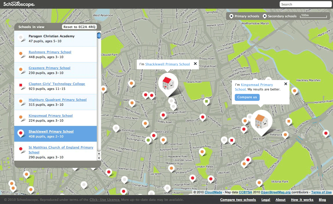
All the school pages floated on top of a live map, where each school was clickable, and talked about itself in comparison to the schools nearby. Custom maps = many hours of deep, headphones-on pixel pushing.
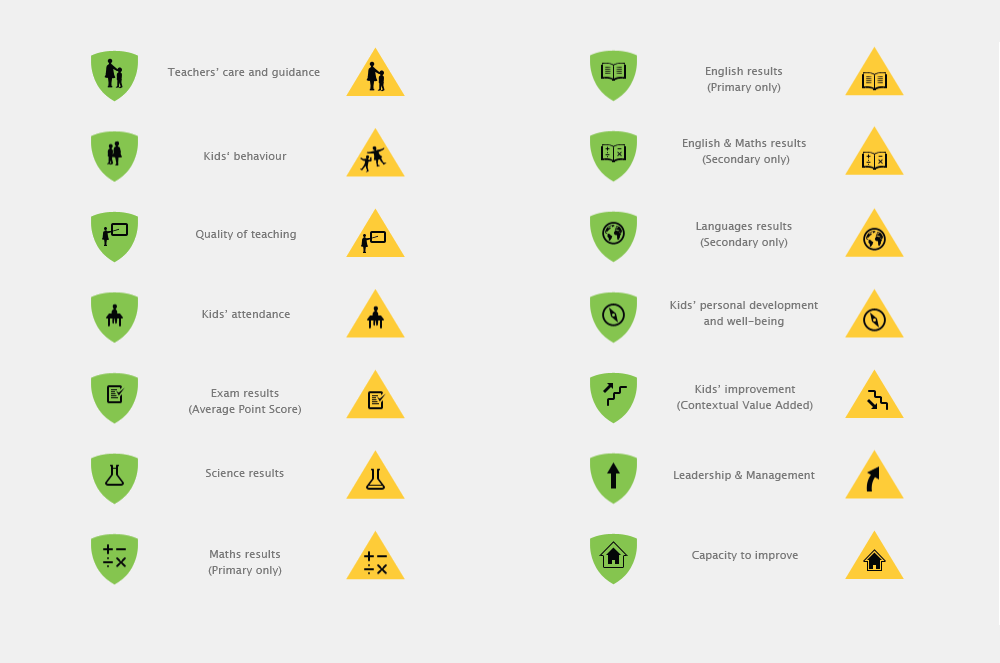
There was a lot of icon work to do, too. Again, many afternoons of drawing and pixel-pushing, and listening to krautrock.
I drew the initial logotype as well. Here’s a work-in-progress version complete with scribbled feedback from type don Phil Baines! A proud moment.
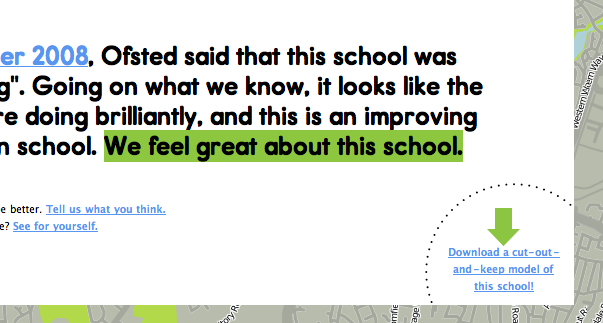
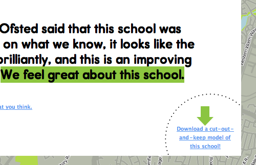
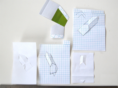
Every school page was printable, and it also provided you with a little cut-out-and-keep paper model of the school building itself.
It was a great experience to be able to invent and work on a new product almost completely from scratch. BERG were a unique, colossally-talented crew, and the inventiveness and playfulness of our design process shone through on the site itself.